Open House: Jayme + Sean Lang
June 5, 2012
We’ve got a special Before + After surprise for you all today, submitted by our friend Jayme Lang. She is a local photographer who’s work we’ve featured before and she’s also shot a number of amazing photos sessions for my family over the last couple of years. Jayme and her husband Sean recently purchased their first home and undertook a remarkable renovation in an extremely short amount of time. I was lucky enough to help with the kitchen design and I think that you’ll all agree with me that the final results are pretty fantastic…
Here’s a brief overview of the Lang’s project and a mini “interview” with Jayme:
What was the timeframe of your renovation? We had two weeks from closing until we moved in, and then another month of living in the reno. So about a month and a half. What was the approximate budget? The budget for the kitchen was $10,000 and the budget for the whole house was $20,000 (this included all new flooring throughout…bye bye orange shag carpeting!). What is your favourite room? I think its a tie between the kitchen and the living room for me. What was your design inspiration? The two main inspirations for our kitchen and the entire house were Dwell Magazine and The Brick House. I love a simple, clean, Mid Century Modern look. We spent a lot of time looking through issues of Dwell and reading Morgan Satterfield’s blog.
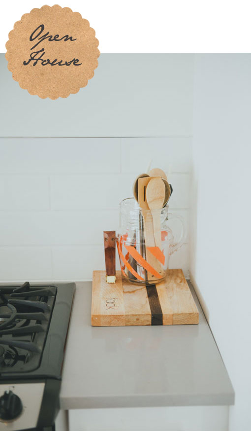
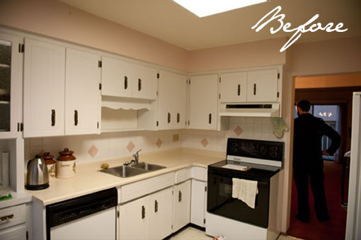
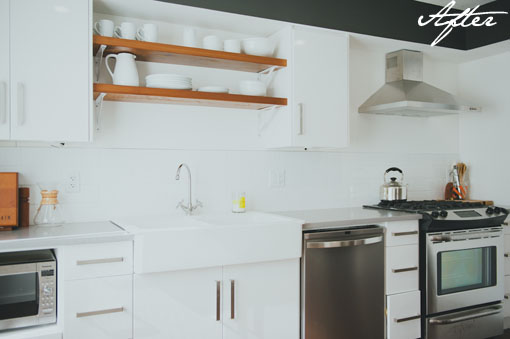
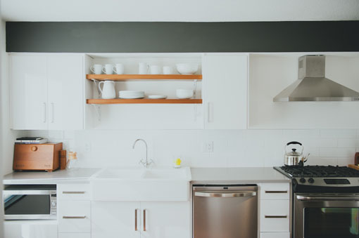
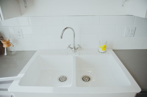
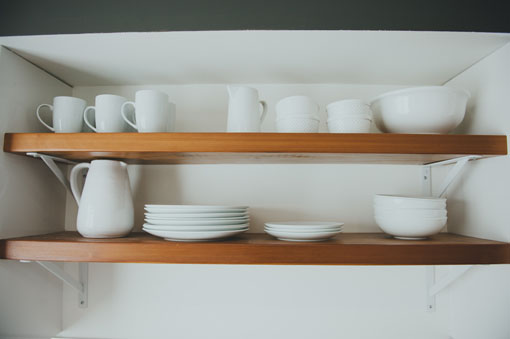
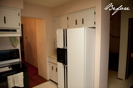
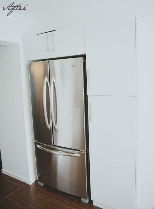
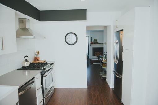
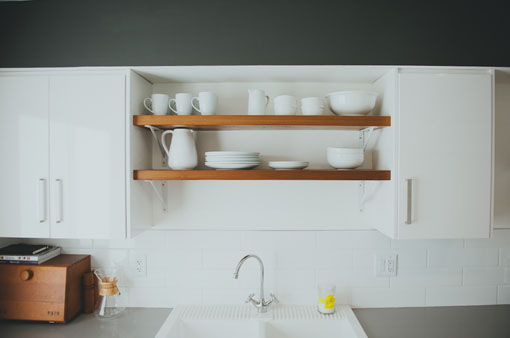
Jayme and Sean were super resourceful when researching their options and had a clear vision in mind for their townhouse, right from the beginning. They were also lucky to have a roster of helpful family and friends eager to help out and Brad and I even joined in on the demolition party…there’s something very therapeutic about smashing old tiles off the walls! While the kitchen is fairly small and had a few “hiccups” (we weren’t able to take down the wall between the kitchen and dining room…of course, every possible electrical wire, plumbing pipe and vent just happened to go through that 4 foot section of wall!), we did manage to squeeze quite a bit of storage into the new space. It helped a tonne that we were able to borrow space from the double hall closet to tuck the fridge back, out of the way. Modern white cabinetry by Generation Cabinets, concrete counters, rustic wood shelves by Tack Woodwork & Design and my favourite double farmhouse sink from Ikea took this little kitchen from outdated pink and beige to white, modern and fresh!
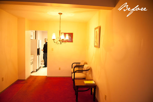
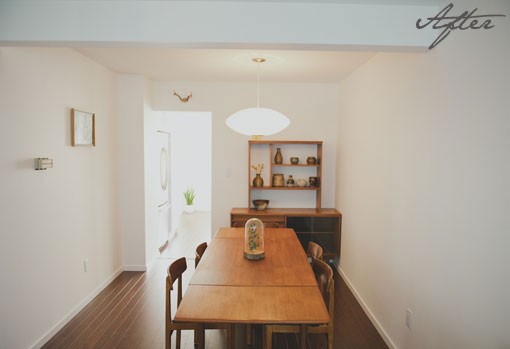
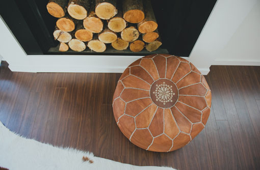
This before photo was taken at night and just doesn’t quite do the original orange shag carpets justice…they were spectacular ! But they really couldn’t stay and now Jayme’s mid century furniture shines against a neutral backdrop of white walls and mid-tone hardwood floors. Tack Woodwork & Design built the custom fireplace mantle with the rustic bark edge and Jayme was lucky enough to win the gorgeous Moroccan pouf from a recent giveaway at The Cross…perfect timing!
I really love the calm, clean lines of their home and think Jayme and Sean did an amazing job, especially for first time homeowners on a tight budget! It just goes to show how much of a difference some good planning and a lot of elbow grease can do for a space. And it was a lot of fun playing with different kitchen layouts again too, something I’ve missed a lot since working for Generation. As certain people can attest to, I may or may not have a bad habit of pushing new kitchen plans onto unsuspecting friends, whether they ask for them or not! What can I say, I love kitchens and making them work as efficiently as possible is always a fun challenge. What “must have” elements would your dream kitchen include?


